Anyone refurbishing their bathroom, kitchen or even the terrace in 2026 should let go of one idea: tiles that imitate parquet are now seen in the interiors world as yesterday’s design. Instead, the spotlight is shifting to genuine-looking materials, confident colour and tactile surfaces. What’s currently appearing in showrooms, architects’ plans and Instagram lofts feels noticeably bolder-yet surprisingly timeless.
Why wood-effect tiles are losing their shine
Wood-grain tiles had an enormous moment: as easy-care as ceramic, with the warmth of real boards. By now, though, many of these floors feel interchangeable. They can read more like a show home than a characterful loft. Interior designers talk about a “false naturalness” that often doesn’t live up to what it promises visually.
"In 2026, the trend is clearly moving away from imitation-and towards honest materials with visible depth, texture and a sense of history."
What people want are surfaces that don’t simply mimic timber, but bring their own identity: stone, terrazzo, handmade tiles, XXL formats, saturated colours and finishes you can feel. If you’re renovating now, these are the directions setting the tone.
Characterful stone-effect: a natural feel instead of decorative ‘film’
A strong contender right now is tilework inspired by natural stone-especially travertine looks. They add a rugged, Mediterranean mood to interiors, without being as delicate as real limestone.
- Travertine look: warm beige and sand shades, irregular veining
- Where it works: bathroom, kitchen, living areas, terrace
- Effect: calm, premium, with an easy southern-holiday feel
Pair it with pale timber, linen textiles and black metal accents for a restrained, quietly luxurious scheme. If you prefer a more contemporary approach, choose large-format stone tiles with minimal grout lines-so the surface reads almost like one continuous slab of natural stone.
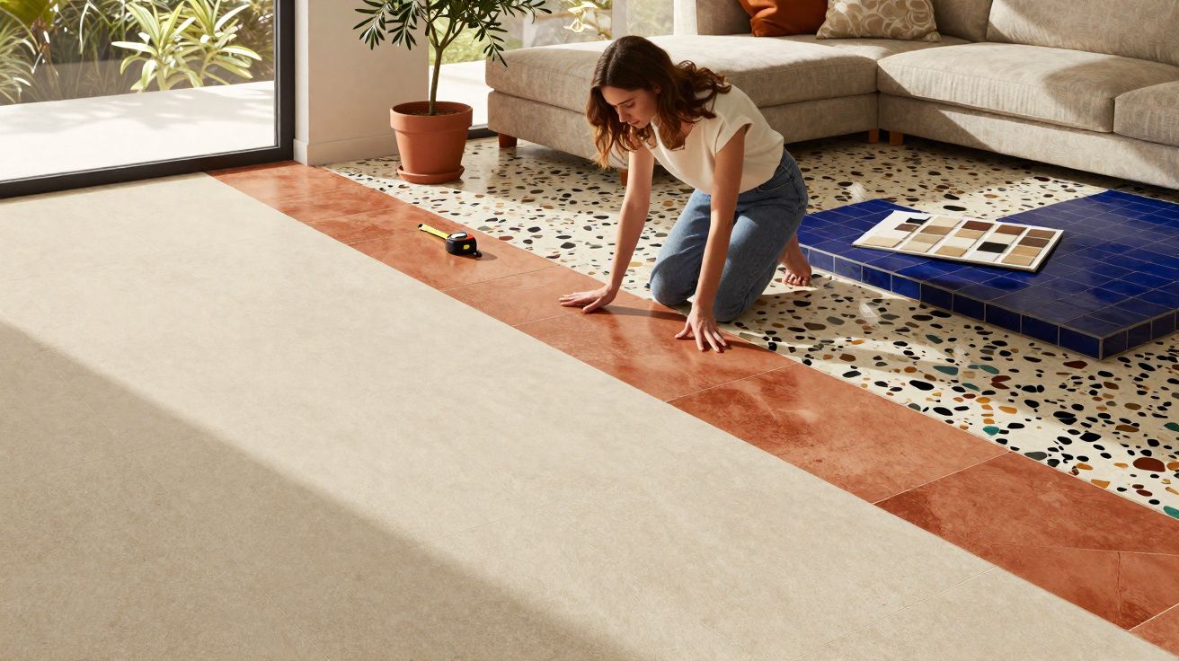
Terracotta’s comeback: warm floors with soul
Something long dismissed as “old-fashioned” is returning in a big way: terracotta flooring. Not as country-house kitsch, but in a modern setting with clean lines and minimalist furnishings. Typical choices are so-called tomettes-small, usually hexagonal or rectangular tiles in red, brick and orange tones.
They’re particularly well suited to:
- open-plan kitchens with an island
- cosy living rooms
- covered terraces and conservatories
"The special appeal comes from slight colour differences between individual tiles-no two floors look exactly the same."
A matte finish absorbs light, making the room feel warm and lived-in. If you’re wary of slipping into “Tuscan romance”, balance terracotta with crisp, modern furniture and pared-back styling. That keeps the look urban rather than overly pretty.
Terrazzo reimagined: from Italian classic to a design statement
Terrazzo has been enjoying a strong revival for years-and by 2026 it firmly belongs in the standard toolkit of trend-aware interior design. Its hallmark is a speckled pattern created by chips of stone or glass set into a binder.
Modern versions focus on:
- understated base tones such as greige, sand or cream
- coloured inclusions in ochre, petrol, sage green or black
- coarse or fine grading, depending on the effect you want
Terrazzo is especially popular in bathrooms and kitchens-sometimes carried from floor up the walls, or used as a worktop. The result feels clean and graphic, yet unexpectedly homely. There’s also a practical plus: the speckled look disguises small marks far better than smooth, plain tiles.
Handmade ceramic: Zellige-style tiles for bold accents
High on wish lists are glazed ceramic tiles with a crafted feel-deliberately irregular edges and a gently rippled surface. Manufacturers often take cues from Moroccan Zellige styles, without copying them one-to-one.
"Glossy, lively surfaces can make kitchen splashbacks and shower walls feel like small art pieces-moving away from the sterile ‘bathroom tile’ look."
Typical places to use them:
- splashbacks behind the hob and sink
- shower niches and vanity zones
- living-area alcoves, for example around fireplaces
Rich colours such as emerald green, inky blue or a deep bottle green are all possible. Used on smaller sections, a little material goes a long way while still delivering real impact.
XXL tiles: minimal grout, maximum impact
Large-format tiles remain a key direction. Edge lengths of 100 x 100 or 120 x 120 centimetres are now standard in the premium segment. The fewer grout lines you can see, the calmer and more generous a room tends to feel.
| Format | Effect | Best for |
|---|---|---|
| 60 x 60 cm | modern, classic, versatile | almost any room |
| 100 x 100 cm | crisp, pared back, makes spaces feel larger | bathrooms, living areas, hallways |
| 120 x 120 cm and larger | near-seamless look, very premium | open-plan layouts, lofts, showrooms |
In small bathrooms, a large-format floor can stop the space feeling chopped up. Careful installation matters, so tiles don’t cup or tip. Many installers charge a bit more for laying XXL formats-but plenty of homeowners still feel the visual payoff is worth it.
Making a statement with colour: from soft red to midnight blue
After years dominated by grey and greige, more people are embracing colour again. The goal isn’t loud, fluorescent tones, but shades with depth.
Popular options include:
- soft reds with a slight pink undertone for hallways or living rooms
- high-light yellows for kitchens and work areas
- deep night blue for bedrooms and elegant dining spaces
- pairings such as brown with dusty pink, or beige with petrol
"In many projects, coloured porcelain stoneware replaces classic wall paint-especially where durability and easy maintenance matter."
If a fully coloured floor feels like too much, you can introduce colour through borders, inlays or coloured skirting tiles. That keeps the base tone neutral while adding an individual signature.
Texture and relief: tiles you can actually feel
One of the biggest movements is towards surfaces that don’t just look different, but feel different too. Relief tiles, 3D patterns and lightly grained matte finishes add energy to otherwise calm rooms.
Typical applications include:
- shower feature walls
- wall areas behind the sofa
- stairwells and entrance zones
Matte, slightly rough finishes recall raw earth or stone and pair especially well with warm, natural colour palettes. Geometric 3D tiles can read almost like wall sculptures and need very little additional decoration.
How to combine the new tile trends effectively
Things get most interesting when these materials are mixed with intention. A few examples seen in current projects:
- travertine-look flooring paired with handmade ceramic in a strong green on the wall
- terrazzo tiles on the bathroom floor combined with smooth, plain XXL wall tiles
- a terracotta kitchen floor alongside simple white fronts and stainless steel
The key is a clear hierarchy: either the floor takes centre stage and the walls stay quiet-or the other way round. Too many competing patterns in one room quickly creates visual noise.
Practical planning tips for 2026
If you’re building or renovating now, it helps to answer a few questions before a showroom display sways you:
- Which areas need to be especially easy to maintain (e.g. hallway, kitchen, children’s bathroom)?
- How much daylight does the room get? Dark tiles can feel heavy when light levels are low.
- Should the room read cool-minimalist or warm and cosy?
- Which colours dominate your furniture and textiles?
For families or pet owners, matte, lightly textured finishes are often a smart choice. They show fewer scratches and water marks than high-gloss tiles. In very small rooms, a continuous, uniform floor finish-ideally with minimal hard transitions-can also make everything feel larger.
Risks and opportunities in the new tile trends
Choosing strong colours or highly distinctive patterns always brings a small risk: in a few years, the look might feel like “too much”. On the other hand, those exact choices can create rooms with personality that stand out from the crowd.
To reduce the risk, a clear strategy helps: keep long-lasting areas such as floors and shower zones calmer, and place bolder tiles where they’re easier to change-like a kitchen splashback or a small niche. That way, your home stays adaptable without constantly turning into a building site.
It’s clear that wood-effect tiles won’t vanish from DIY stores overnight. But if you want a home with a genuinely modern feel in 2026, the direction is authentic-looking materials, generous formats, confident colour and tactile texture. That’s where the real trend is happening-well away from pure imitation.


Comments
No comments yet. Be the first to comment!
Leave a Comment